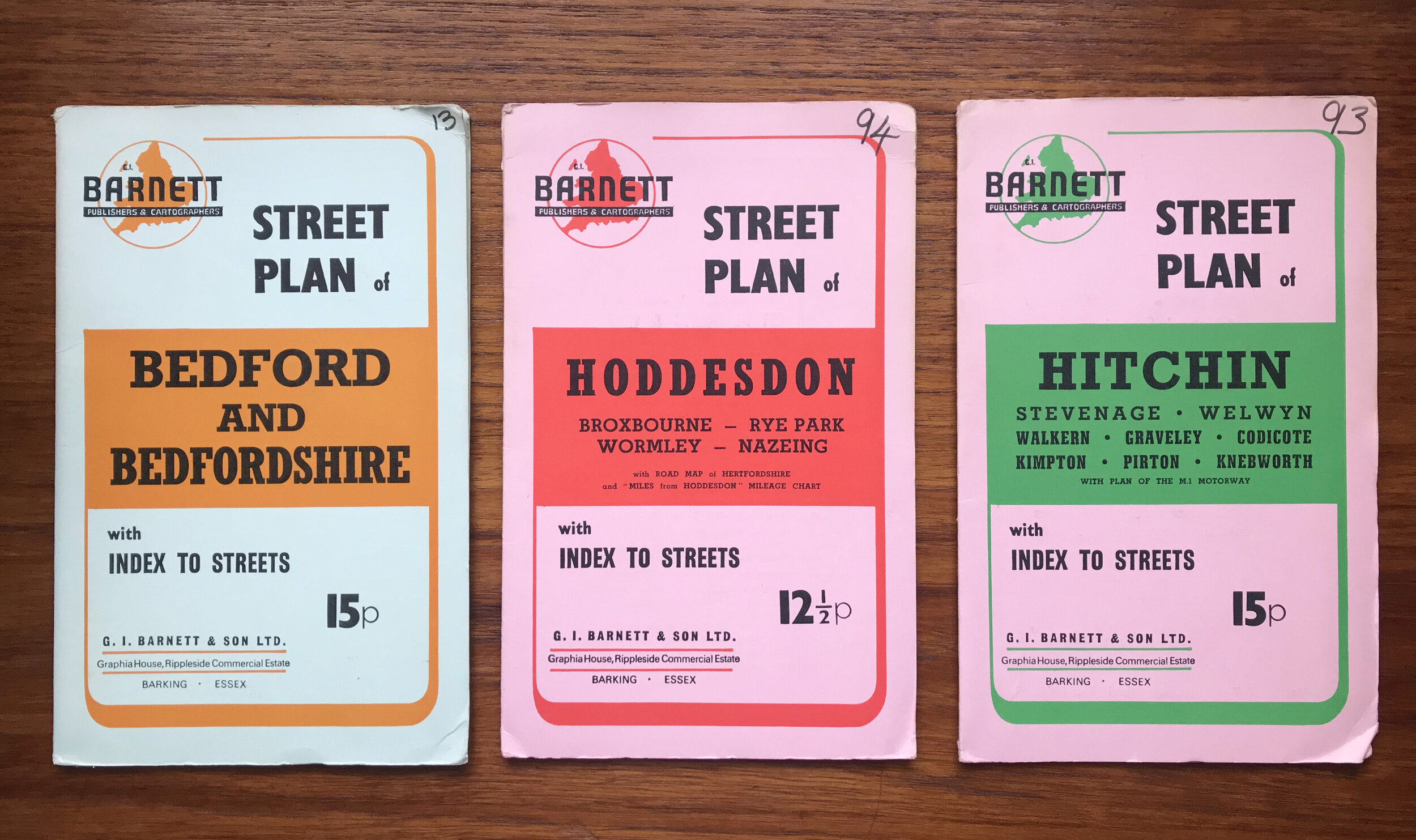
I love that even the very practical field of cartography couldn’t escape psychedelia.
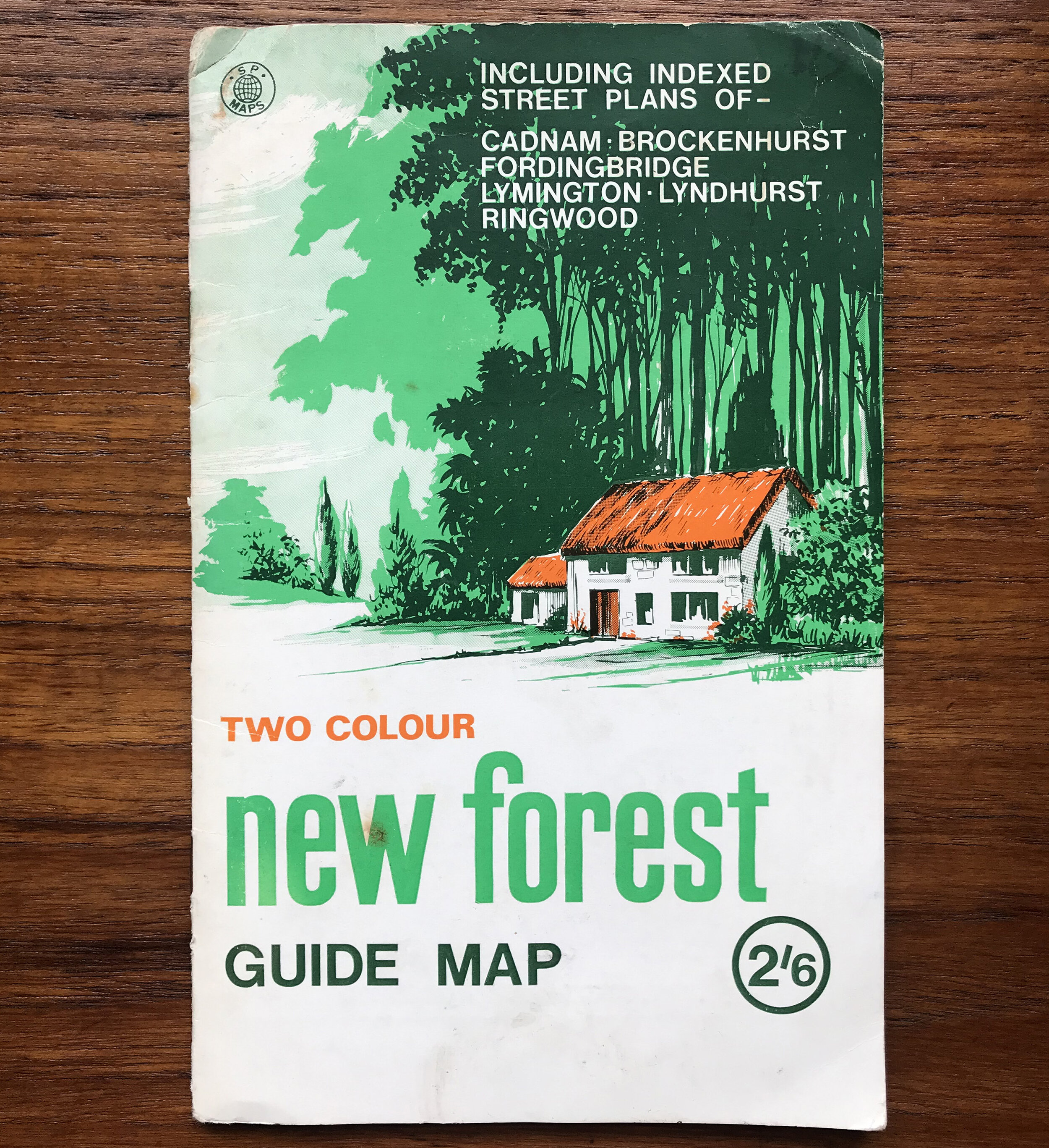
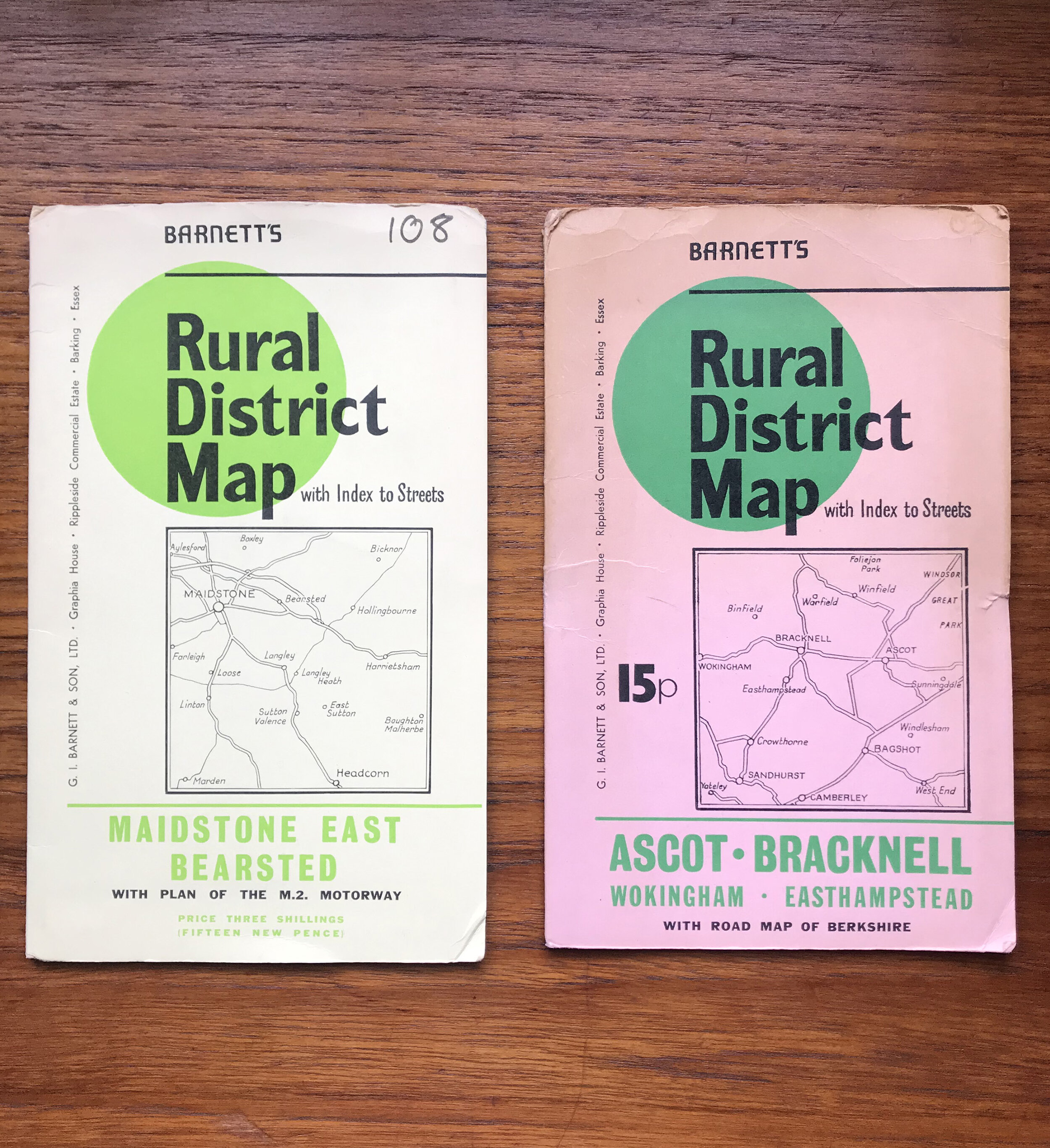
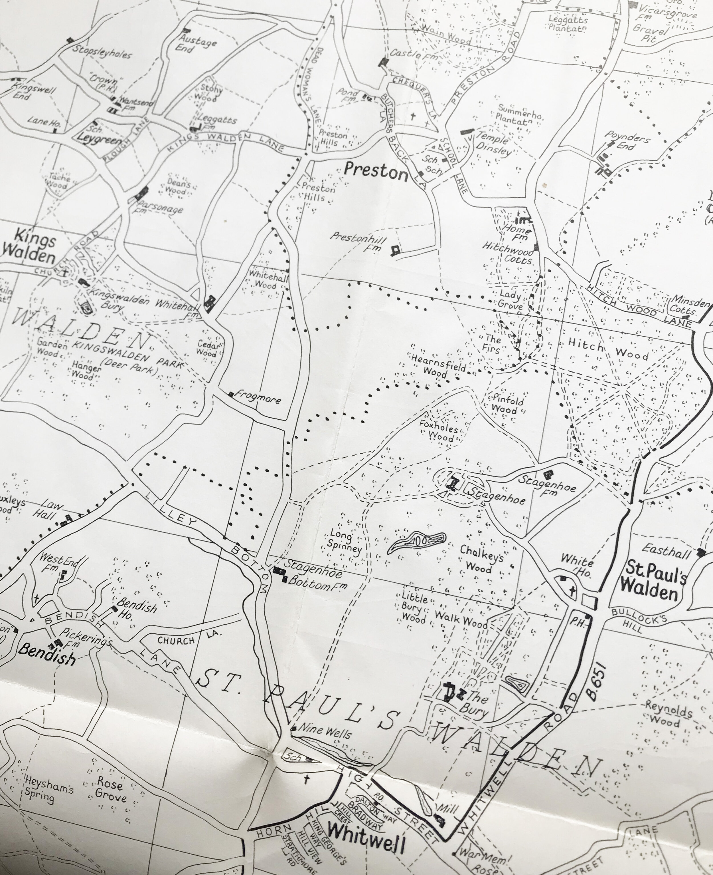
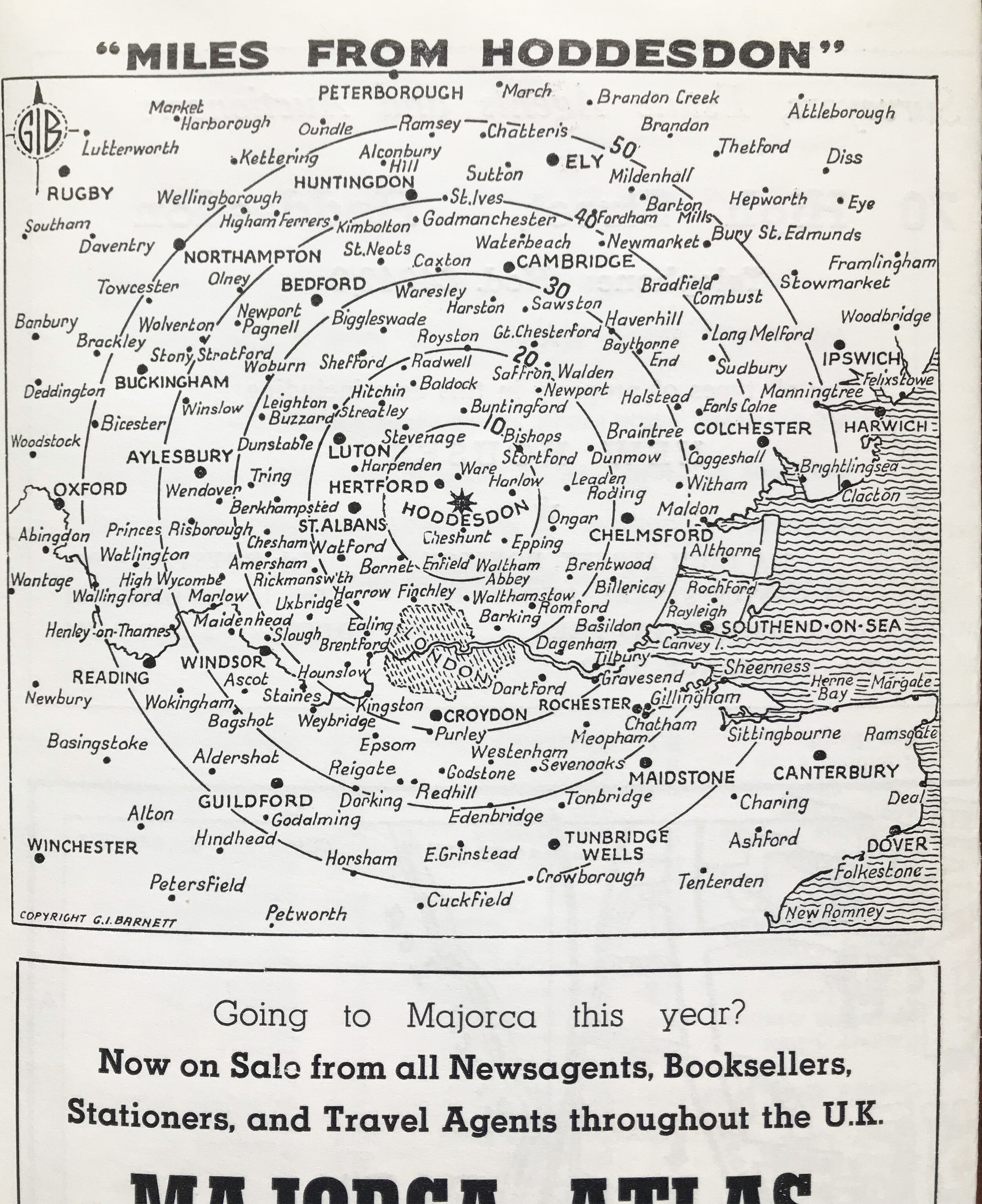
I came across these mid 20th Century maps in a charity shop on the South Coast. They aren’t dated but judging by the prices and adverts, they are from the 1960s and 1970s.
I thought I’d share them because the graphic design is just brilliant, the combination of hand-written and typeset typography in particular. All of the maps were printed in two colours, presumably by litho. I’d love to know why bright pink card was chosen. Perhaps so it would be easy to spot in the glovebox?
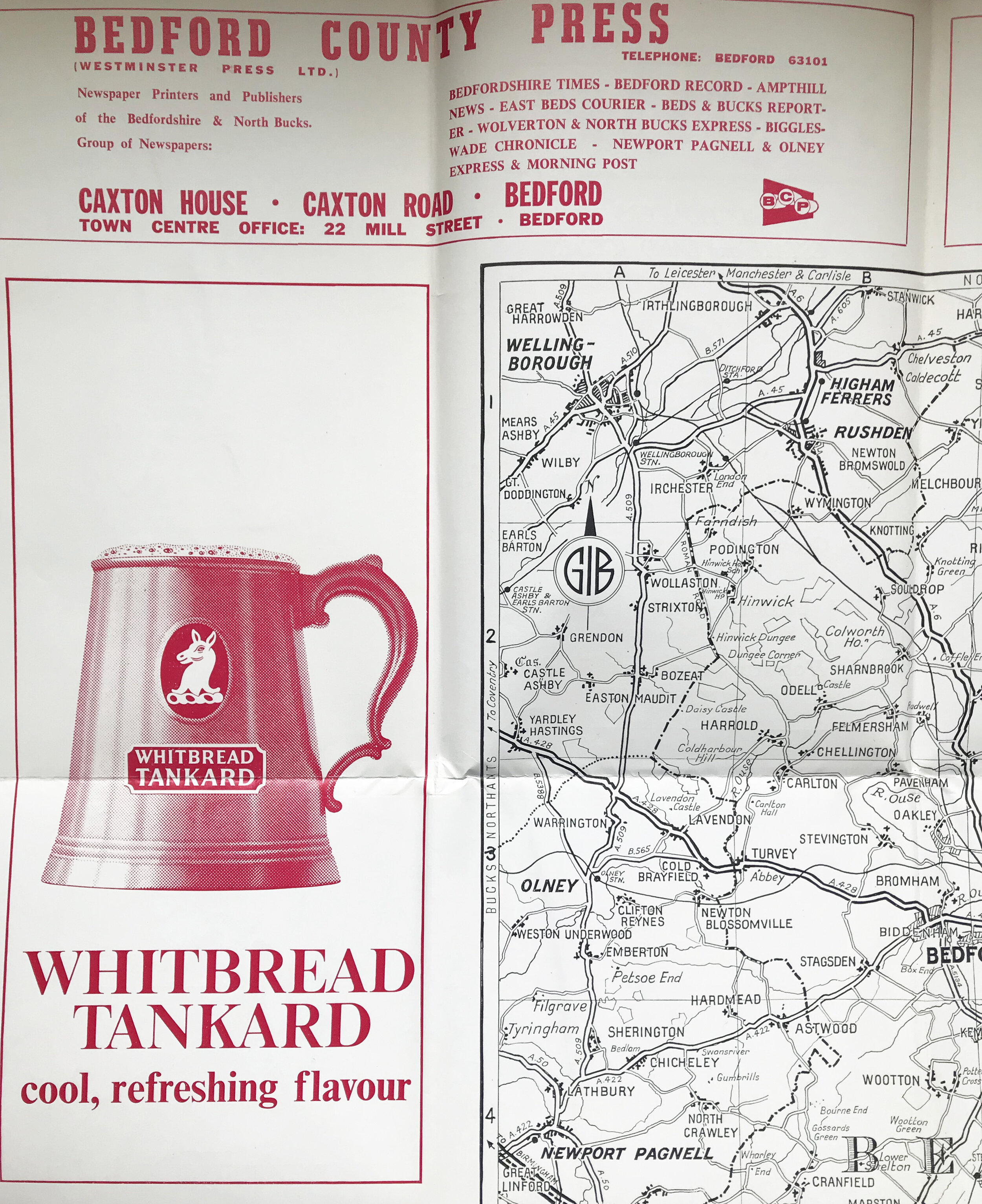
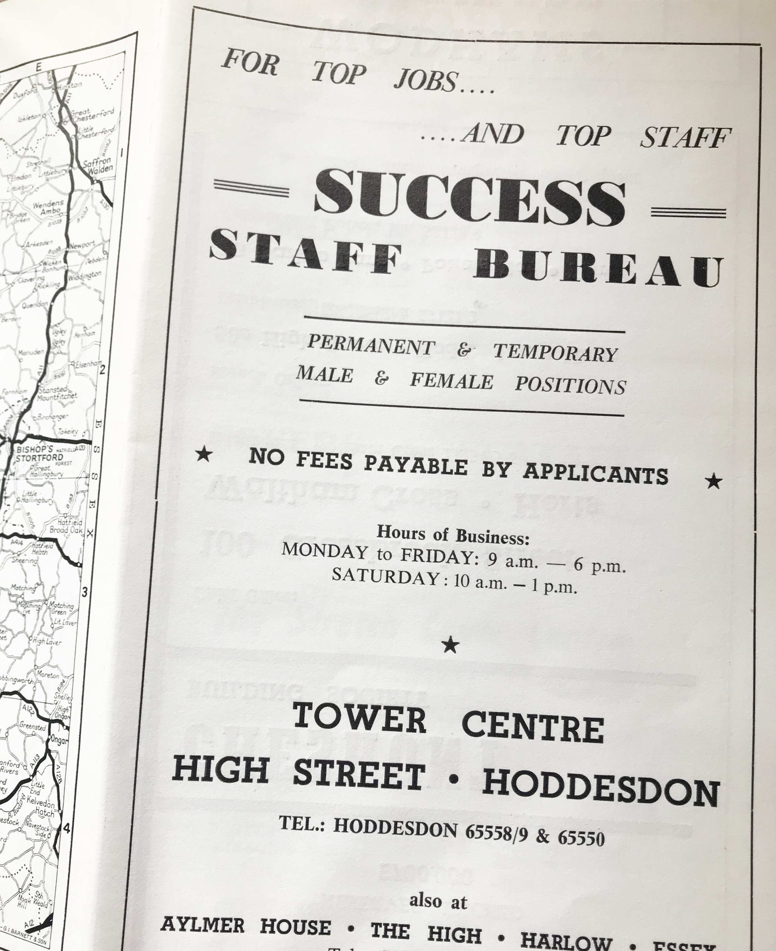
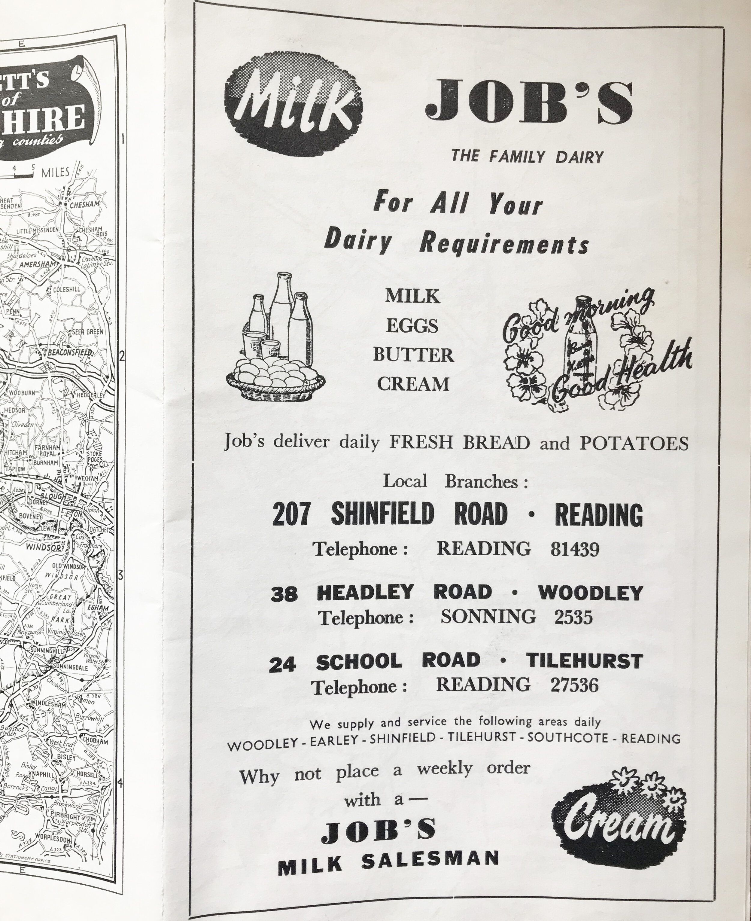
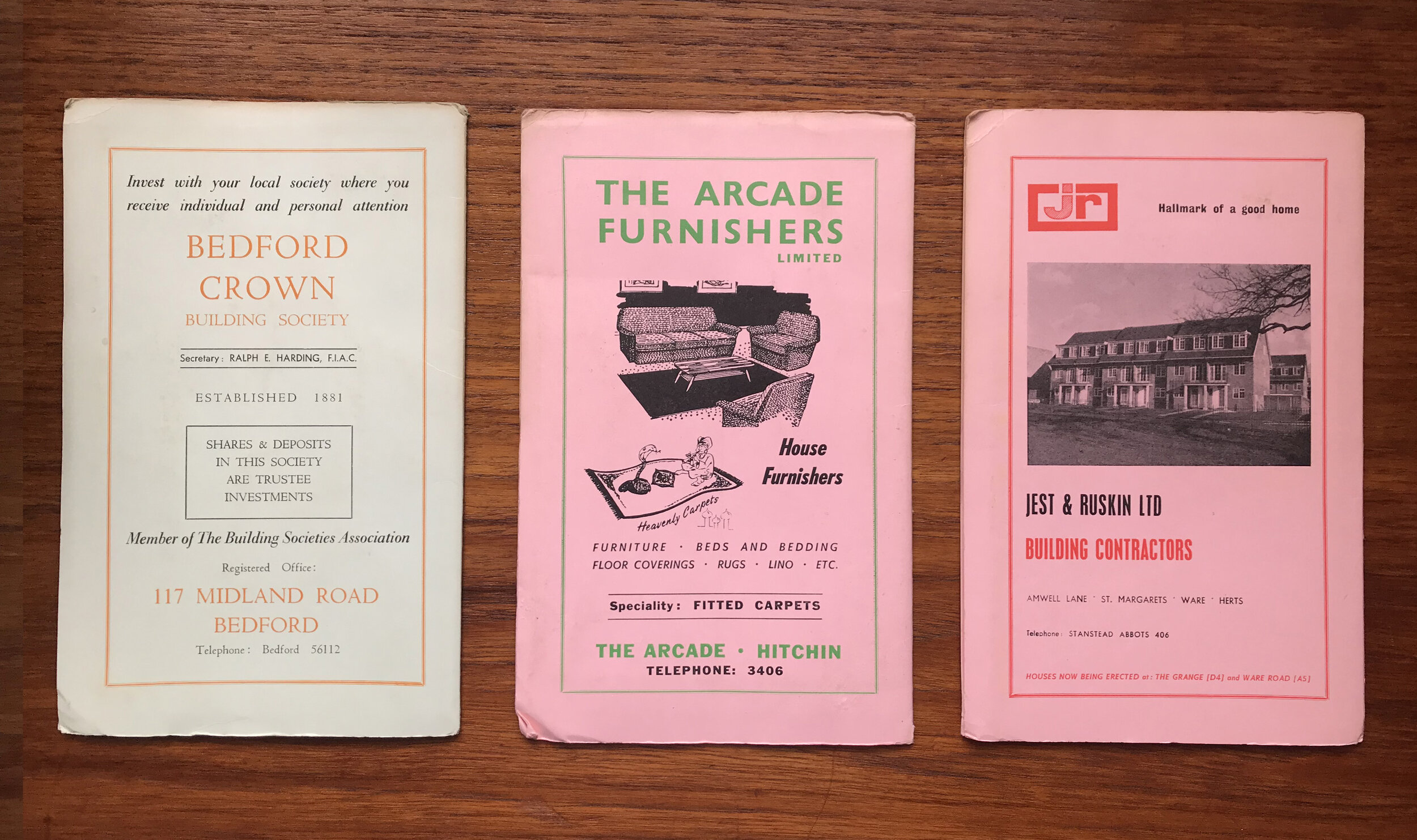
It’s also interesting to see the variety of companies that were advertising through maps. The earlier maps have car and beer advertisements, then by the 70’s, when cars were becoming cheaper and more accessible, along with Britain’s increasing disposable income, adverts are taken out by clairvoyants, finishing schools and zoos. The maps really reflect the changes in society.
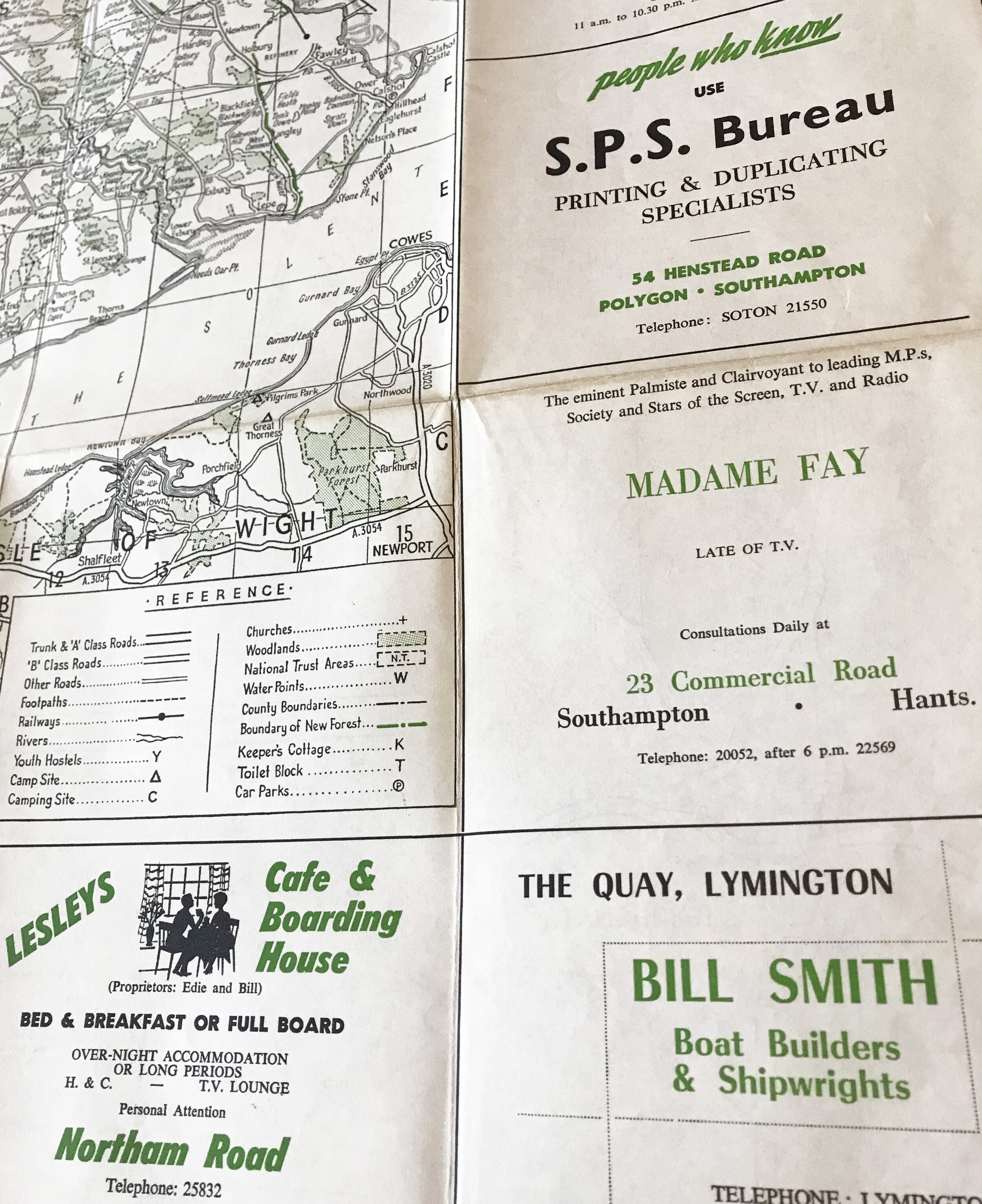

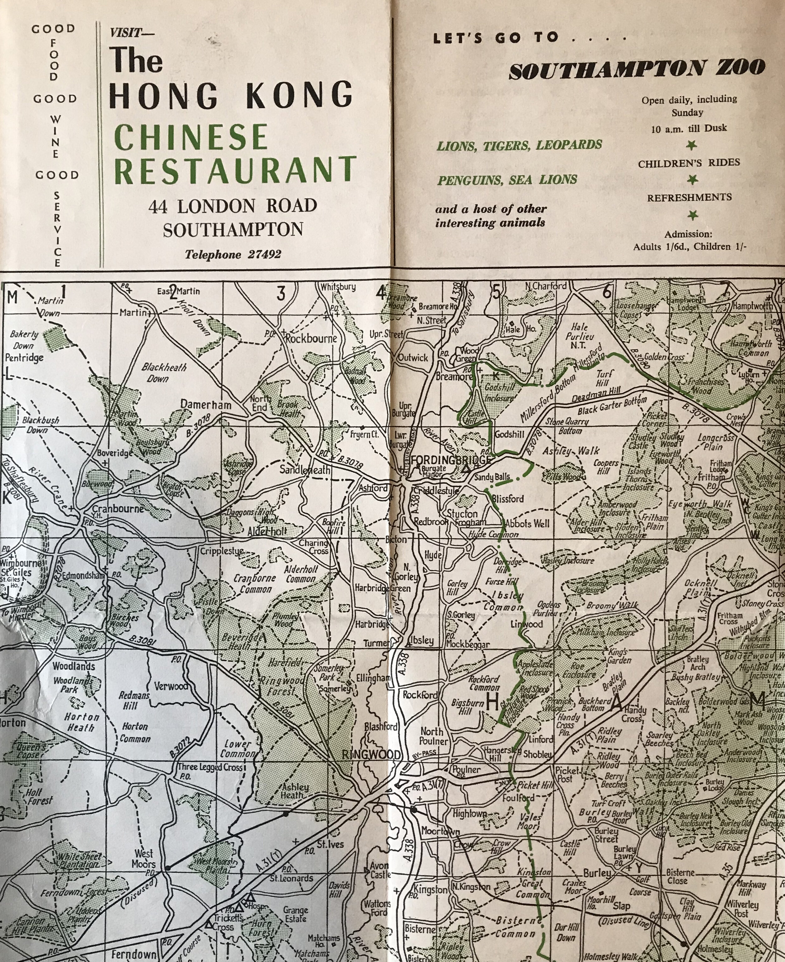
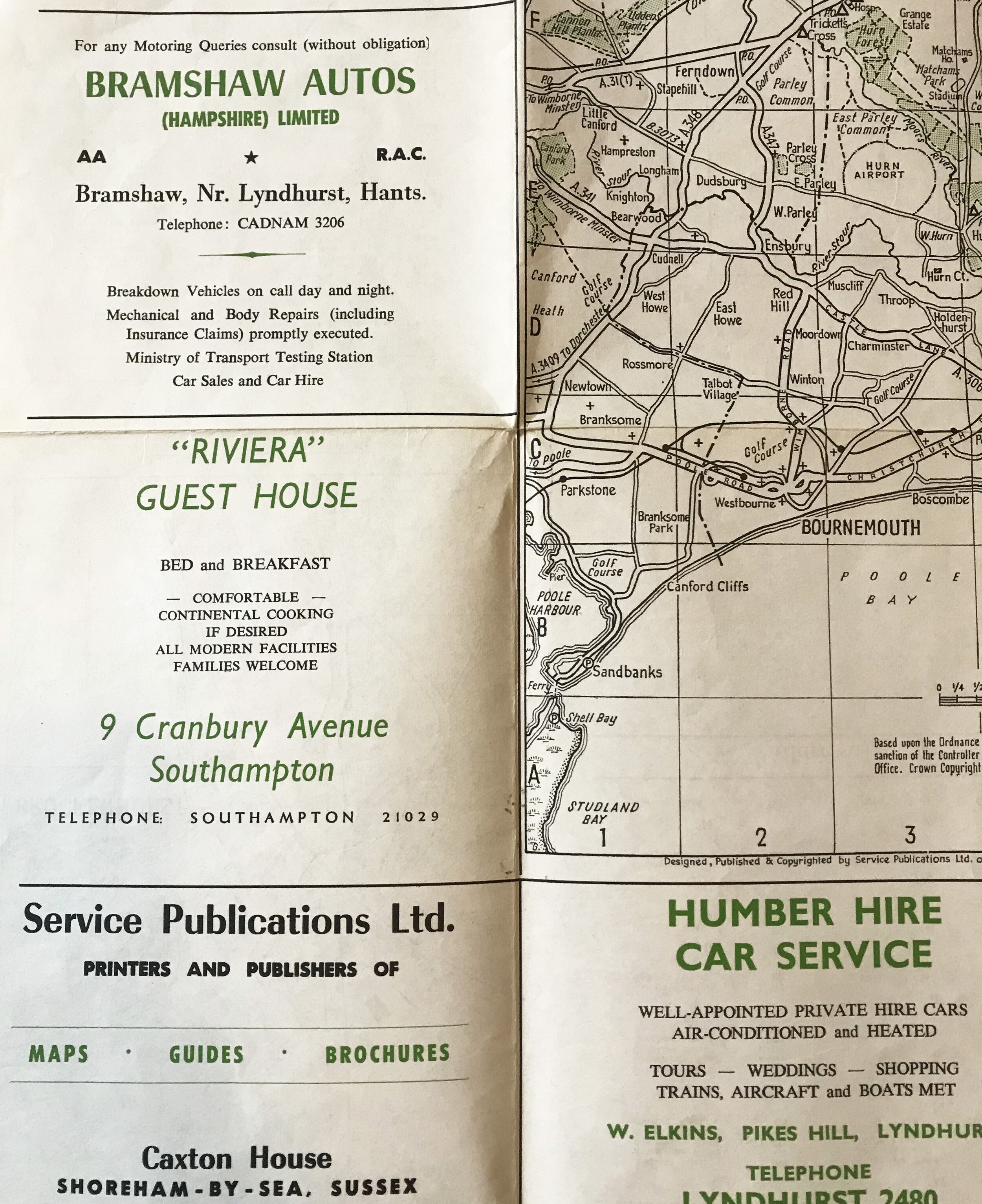
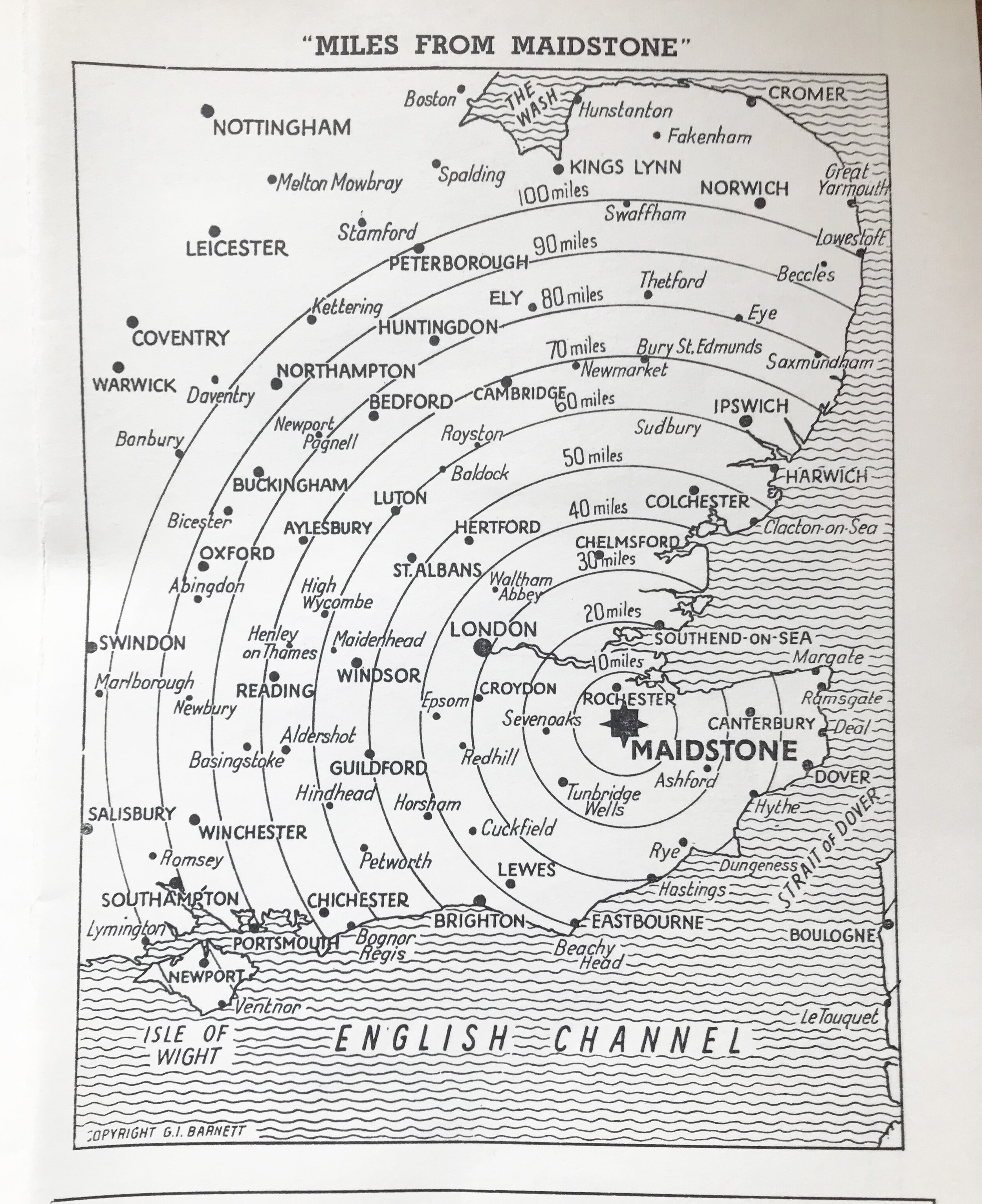
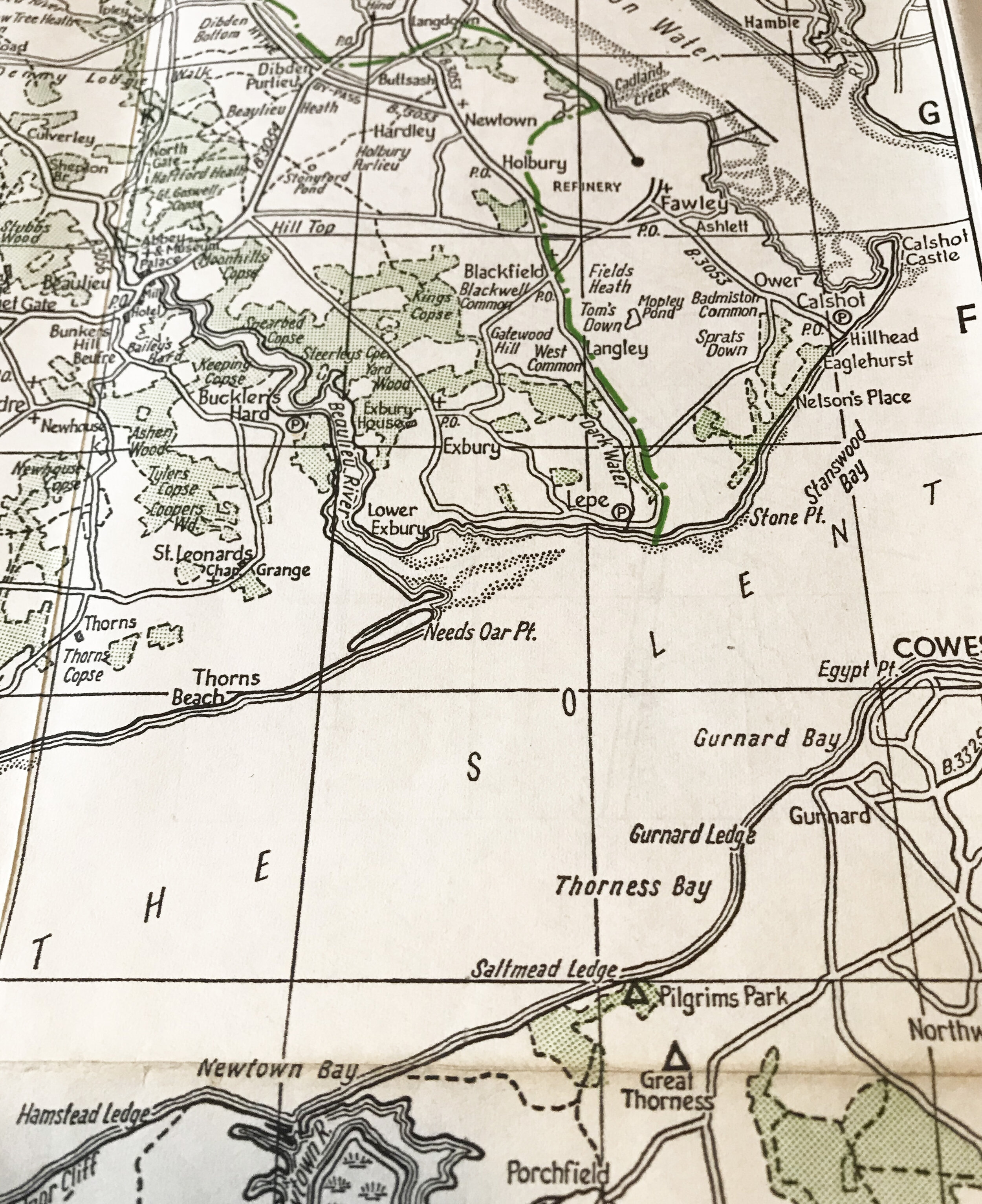
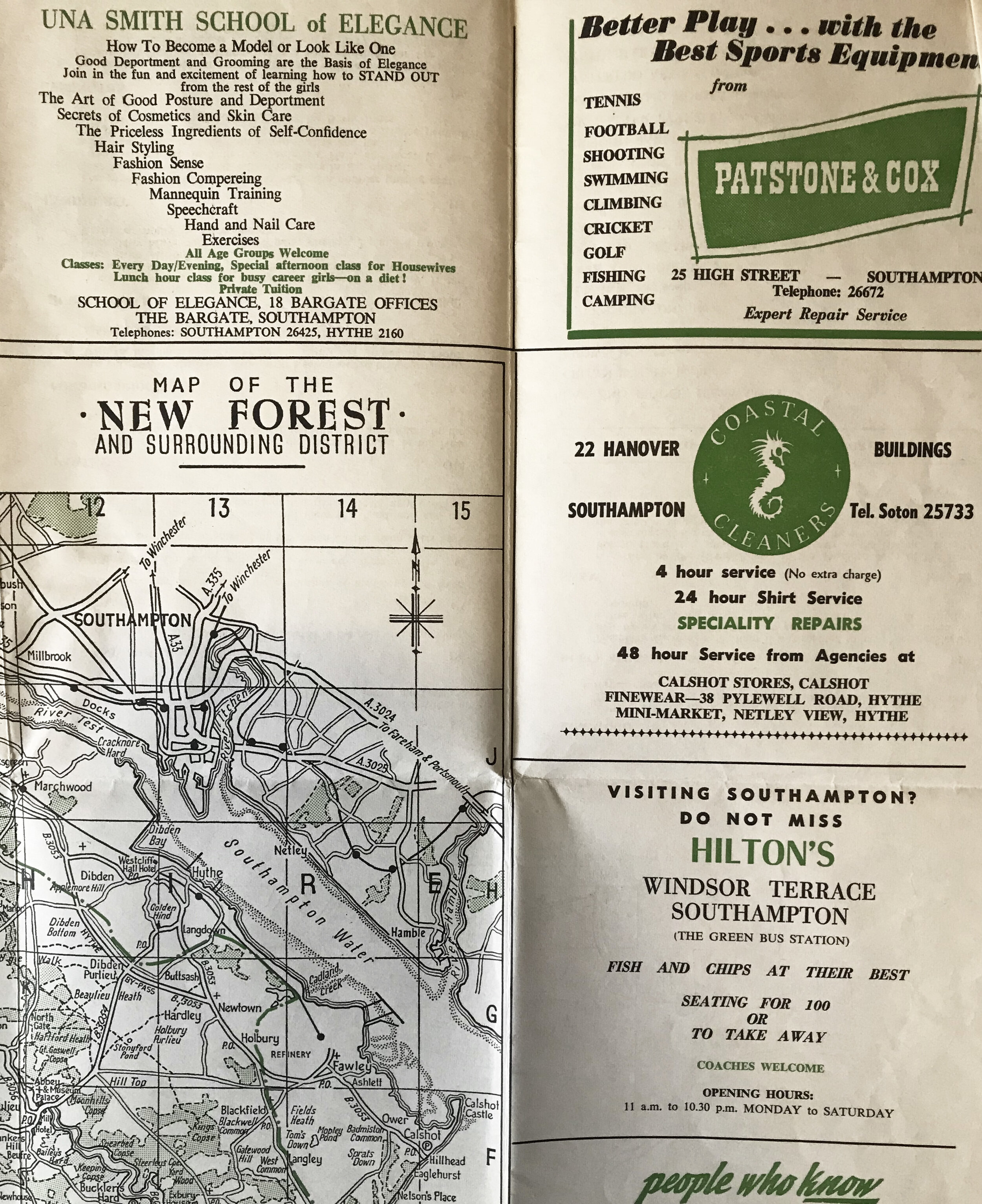
There isn’t any information about this generation of maps on the Barnett website, who have been making them now for nearly 70 years. They now specialise in mapping out doctors surgery boundaries.
Further reading on mid-Century cartography on the Ordnance Survey blog (yes that’s a thing) - https://www.ordnancesurvey.co.uk/blog/2011/03/cartography-from-past-to-present/
I promise it’s interesting - they used gramophone needles to etch into plastic for printing, and the cartographers were treated to a cigarette trolley doing the office rounds twice a day.


