Rogers Drums catalogue cover, 1970
I’ve played the drums now for over half my life, and I’ve been thinking recently about how uninspired the graphic design around drumming is. Even if you don’t play drums, you might have an idea in your mind of what a drummer looks like, or what sort of aesthetic the magazines, drums and related gear might have.
I am often told that I don’t look like a drummer, and when I look at drumming magazines and gear websites, I can’t help but agree. It feels like a world that I will always be on the edge of - a boys club with outdated, macho names for gear - “Iron Cobra”, “Black Panther Blaster”, “Rydeen - the God of Thunder”.
There’s a very successful brand of protection cases whose logo is even a bald dude with a goatee. You’ve probably seen him playing your local beer festival.
Their website features a photo gallery of drummers who look like this. I own some of these cases and I have to admit I have sharpied over this face that reminds me I am different. But why not go one better? Why not design some more gender neutral gear for the drummer of 2019?
To begin looking forward, I looked back. Thanks to drumarchive.com and notsomoderndrummer.com I found some wonderful (and ridiculous) 20th Century drum catalogues. Here’s a selection of my favourite designs.
Ludwig catalogue cover, 1927
Single-colour, jazz age design. I love the text bubble alluding to a smoky jazz club.
Ajax drums catalogue, 1952
By 1968 Ajax’s front covers are more psychedelic, but the graphic design inside is still pretty mid-century modern.
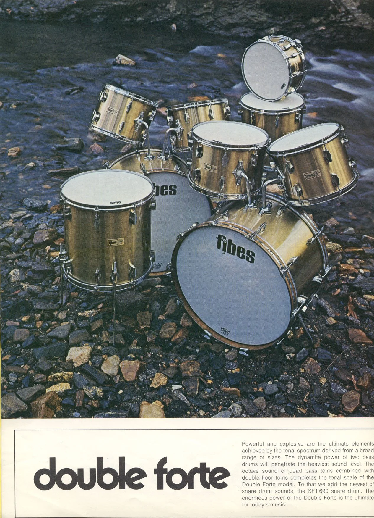
Fibes catalogue, 1972
I’m into these natural locations from 1972, echoing the seventies zeitgeist for plants and natural materials.
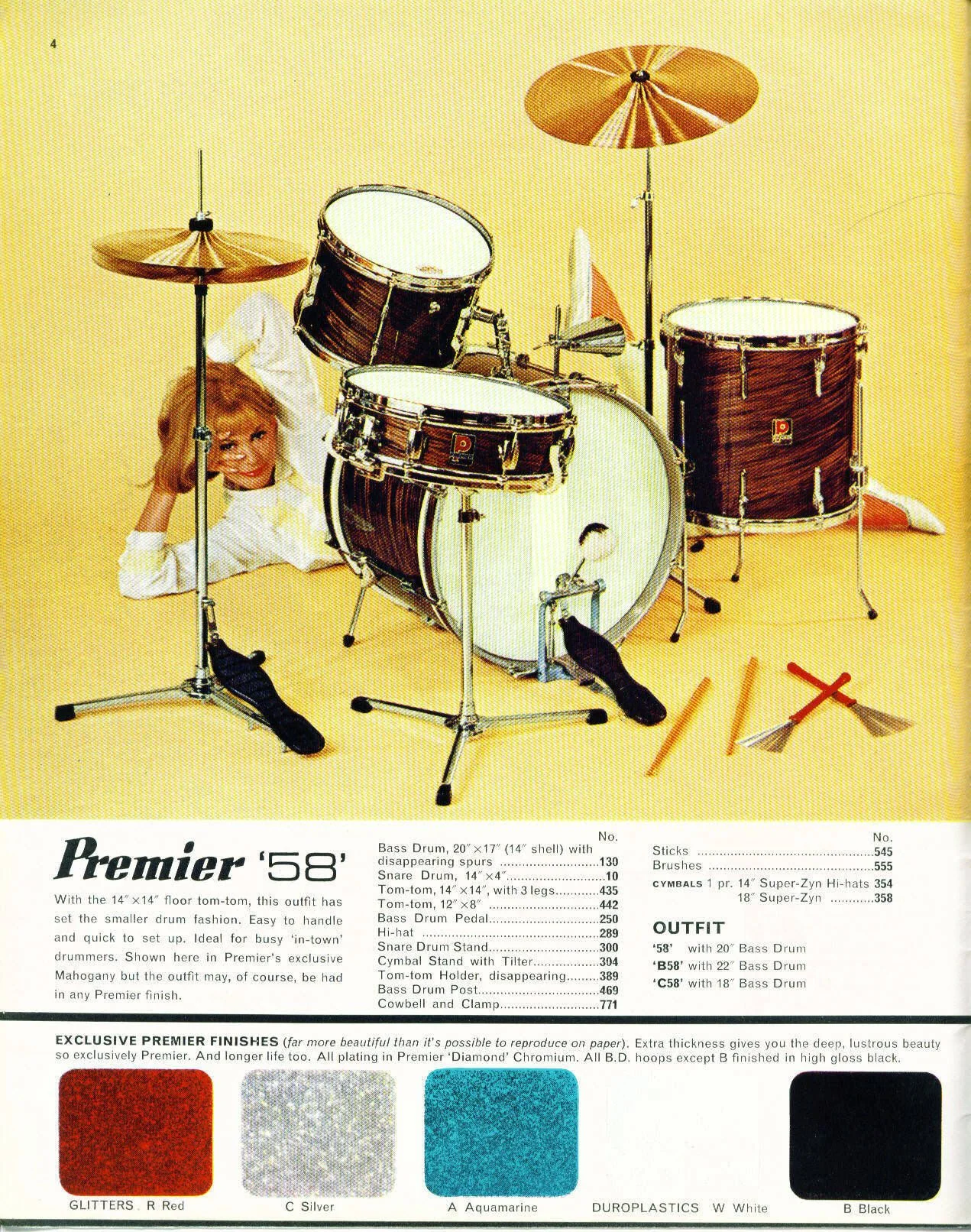
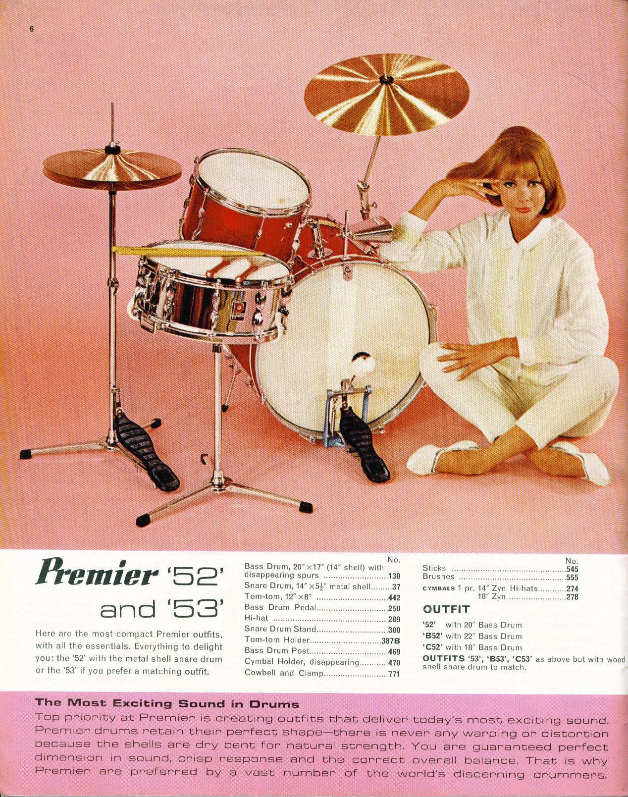
Premier drums catalogue pages from 1966. SO sixties.
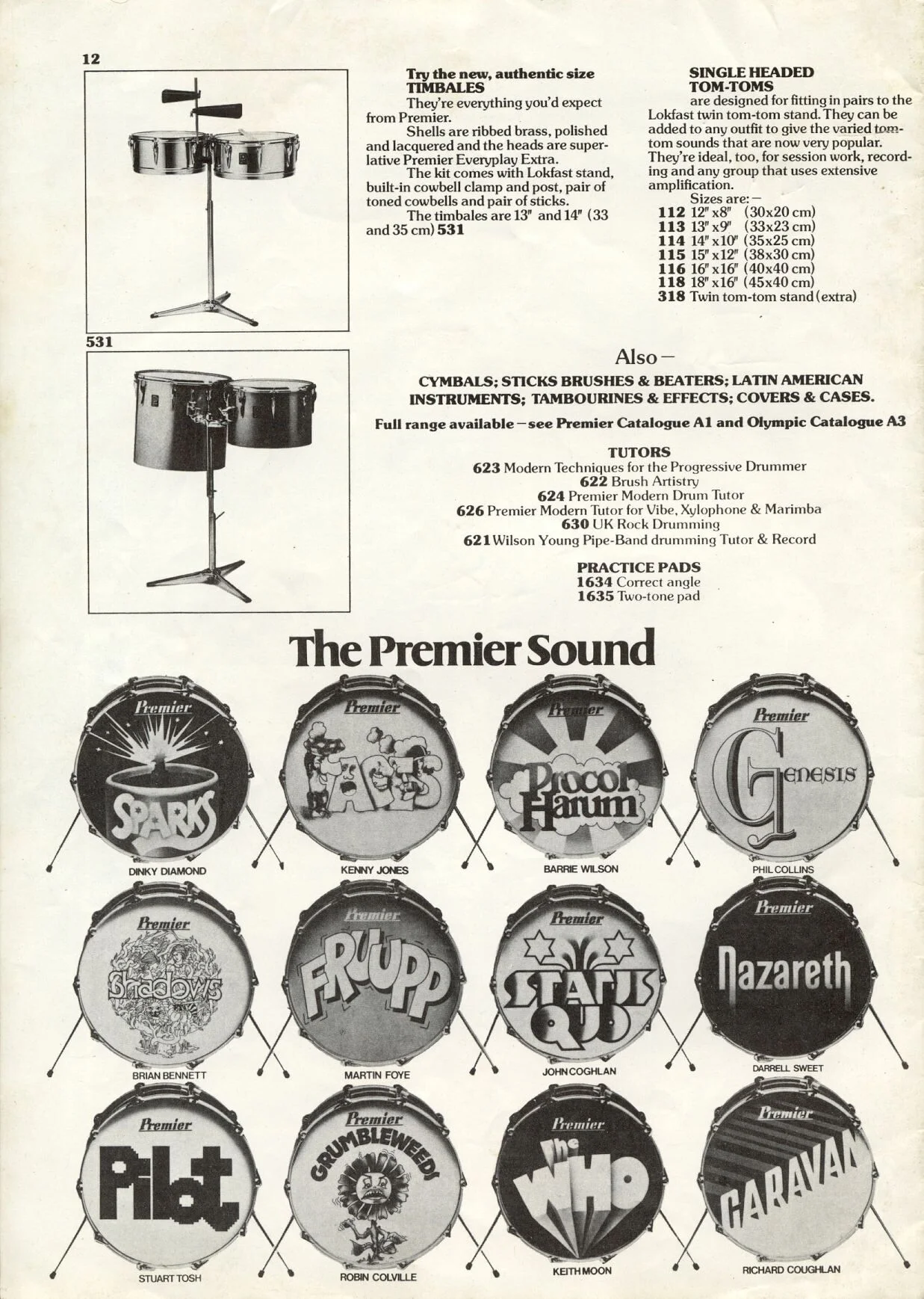
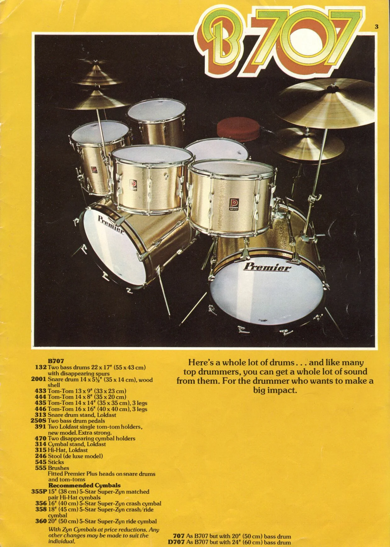
Now we’re getting into it! The Premier catalogue from 1977, looking exactly like a music annual. Now where’s the pull-out poster of Rod Stewart?
Pages from the Trixon catalogue, 1968, including the Speedfire drum kit (bottom right), designed in 1955. Pure surrealist Dali vibes!
The Ludwig Vistalite kit, from the 1975 catalogue. Natural materials are out the window! The Vistalite was co-invented with Elvis Presley’s drummer Ronn Tutt, but he hated them so went back to maple. It looks like sponge or bubble printing was used for the artwork’s texture.
The Ludwig Vistalite logo, 1973 - is it a form of the Stripes font?
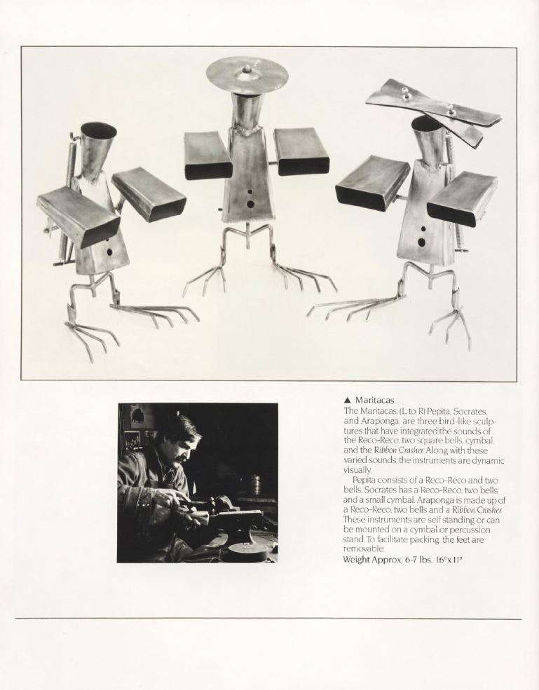
Metal girlfriend aside, there’s something quite Dada about Pete Engelhart’s percussive creations. I like the high contrast photography as well. This catalogue is from the mid eighties but the photos remind me of Eileen Mayo and Gertrude Hermes’ wood engravings.
For my gear brand, I’ve taken inspiration from Mid-Century Modern design, and the ancient, human compulsion to make rhythms. The first named drummer in history was the Mesopotamian High Priestess Lipushiau, who played a small handheld drum called a balag-di. Male drummers played larger percussion instruments called balag, and both men and women played these in the Temple of the Moon in Ur. I wanted my company to be attractive to both men and women, to span musical genres, and to pay homage to Lipushiau and the spiritual yet vitally human experience of drumming. Here’s a little taste of the project, which I’ll be posting more on soon.


