I’ve never liked acrylic paint. When I’ve used it I’ve been so aware of its plasticity, peeling it off the tube’s screw top and the palette. The colours look so dull and monotone to me, and it dries too quickly to blend and push around.
I got married recently and we went to New York as part of our honeymoon. We stayed at The Jane in the West Village, right round the corner from the Whitney Museum of American Art which a New Yorker friend had recommended to me. We were there right before the Whitney’s Biennial (apparently a big deal) so the exhibitions on display were from their collection. But what a fine collection they have! Here are some of my personal highlights from the exhibition ‘Spilling Over: Painting Color in the 1960’s’. I’m so glad I went because it opened my eyes to what acrylic can do.
“This exhibition gathers paintings from the 1960s and early 1970s that inventively use bold, saturated, and even hallucinatory color to activate perception. During this period, many artists adopted acrylic paint—a newly available, plastic-based medium—and explored its expansive technical possibilities and wider range of hues. Color Field painters poured paint and stained unprimed canvas, dramatizing painting’s materiality and visual force. Painters associated with Op art deployed pattern, geometric arrangement, and intense color combinations to emphasize that vision is a commingling of physical response and unconscious association. At the same historical moment, an emerging generation of artists of color and women explored color’s capacity to articulate new questions about perception, specifically its relation to race, gender, and the coding of space. The exhibition looks to the divergent ways color can be equally a formal problem and a political statement.”
Detail, ‘Gamma Delta’ by Morris Louis, 1959-60.
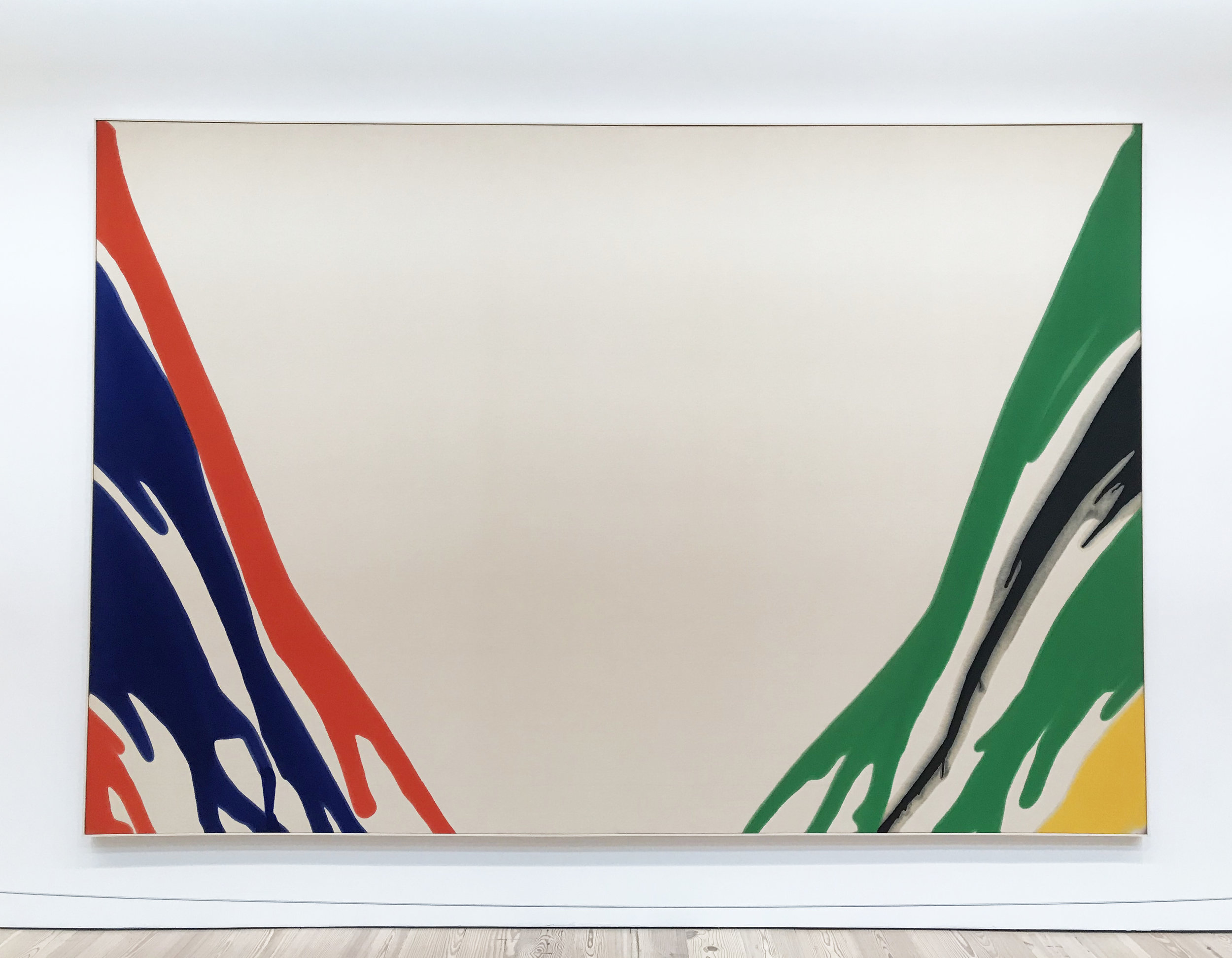
‘Gamma Delta’ by Morris Louis, 1959-60. Magna on canvas.
I’d never heard of Magna before. It’s a brand name of an acrylic resin paint developed in 1947.
“In Morris Louis’s Gamma Delta brightly colored, poured ribbons of paint uncoil to the bottom edge of the canvas, leaving a void in the center. Tom make the work, Louis stained the canvas by diluting and pouring synthetic paints onto its surface, allowing the colors to spread and bleed. Louis explored the technique for nine years, in response to the paintings of Jackson Pollock and especially to those of Helen Frankenthaler, whose studio Louis visited in 1953.”
‘Septehedron 34’ by Alvin Loving, 1970. Acrylic on shaped canvas.
‘Dan Johnson’s Surprise’ by Frank Bowling, 1969. Acrylic on canvas.
“Working without a brush, [Bowling] sprayed paint onto thinly paint-soaked canvases. He then used stencils to create the outlines of continents and countries that had been brutally and dramatically altered by the slave trade.”
‘72, March 195’ by Marcia Hafif, 1965. Acrylic on canvas.
‘Orange' Mood’ by Helen Frankenthaler, 1966. Acrylic on canvas.
Detail, ‘Orange' Mood’ by Helen Frankenthaler, 1966. Acrylic on canvas.
“In Orange Mood, Helen Frankenthaler thinned acrylic paint to the consistency of watercolor in order create large, curving expanses of color through which the weave of the canvas remains visible. Like Jackson Pollock, she placed her canvas directly on the floor and poured paint from above, largely without the aid of a brush.”
I’d never heard of Frankenthaler until this visit. Apparently Frank O’Hara wrote the catalogue for her first major museum show in 1960. I think I’ll do a blog post about my favourite female Modernists because she is now one of them.
‘Bow Form Construction’ by Sam Gillam, 1968. Acrylic and enamel on draped canvas.
Detail, ‘Bow Form Construction’ by Sam Gillam, 1968. Acrylic and enamel on draped canvas.


![‘Dan Johnson’s Surprise’ by Frank Bowling, 1969. Acrylic on canvas.“Working without a brush, [Bowling] sprayed paint onto thinly paint-soaked canvases. He then used stencils to create the outlines of continents and countries that had been brutally a…](https://images.squarespace-cdn.com/content/v1/56b123dd4d088e6dea643f39/1561638990662-7M7S8QFFNNHJLDQL7LUD/IMG_3423.JPG)


